8.12 柱状图 EMP_barplot
柱状图是一种用于展示数据分布情况的统计图。
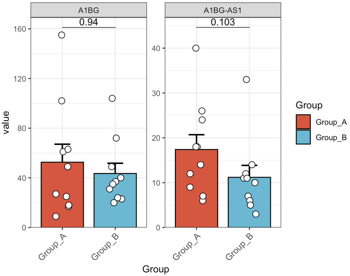
8.1.1 针对丰度数据的箱型图
🏷️示例:
MAE |>
  EMP_assay_extract('host_gene',pattern = 'A1BG',pattern_ref = 'feature') |>
  EMP_barplot(method='t.test',estimate_group='Group')
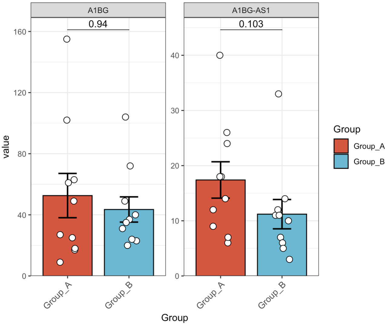
8.1.2 只显示上部误差棒
🏷️示例:
MAE |>
  EMP_assay_extract('host_gene',pattern = 'A1BG') |>
  EMP_barplot(estimate_group = 'Group',error_bar = 'upper')
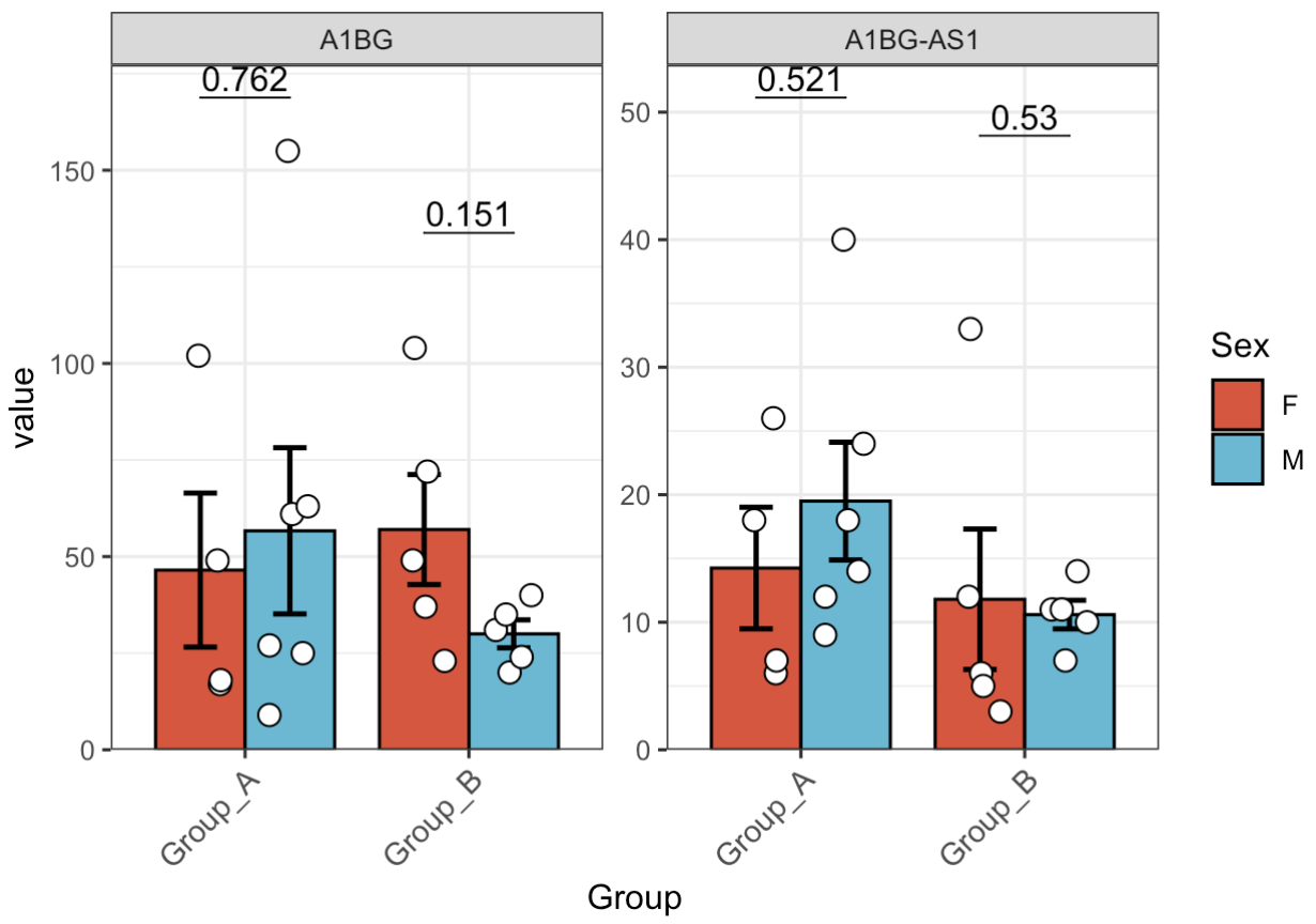
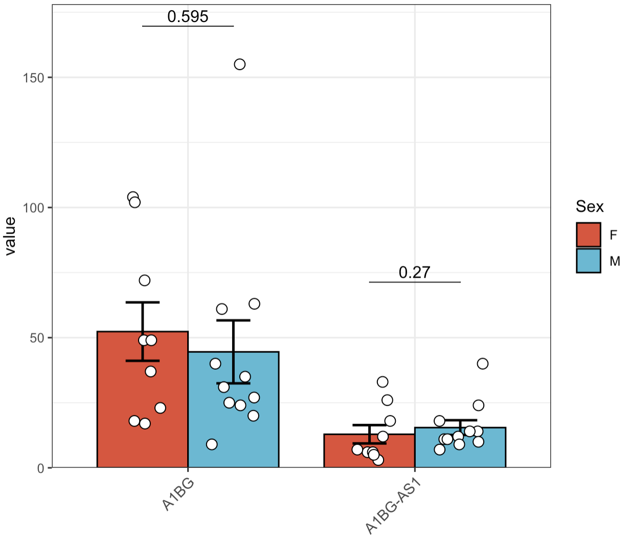
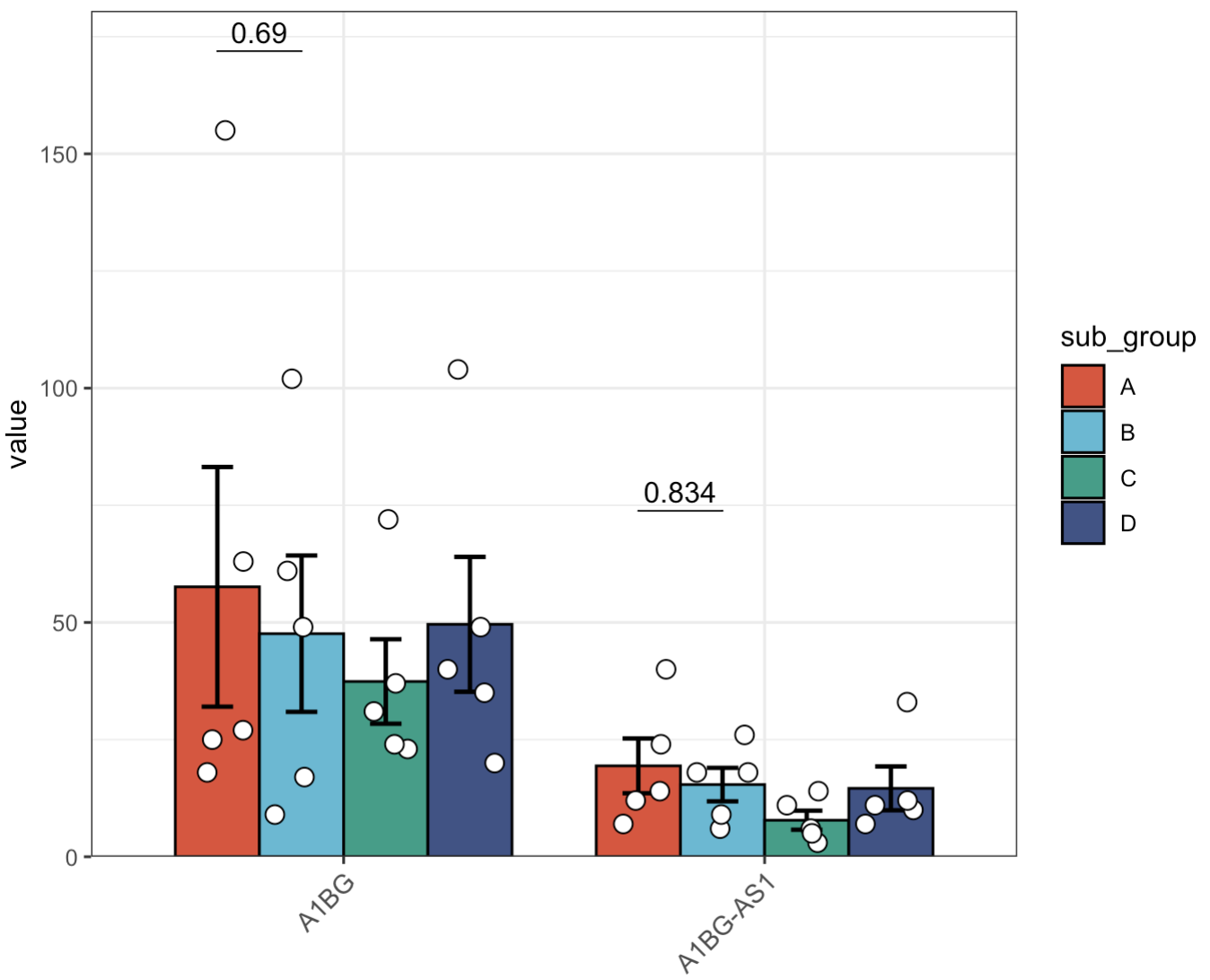
8.1.3 亚组分析
🏷️示例:
MAE |>
  EMP_assay_extract('host_gene',pattern = 'A1BG') |>
  EMP_barplot(estimate_group = 'Group',compare_group='Sex')
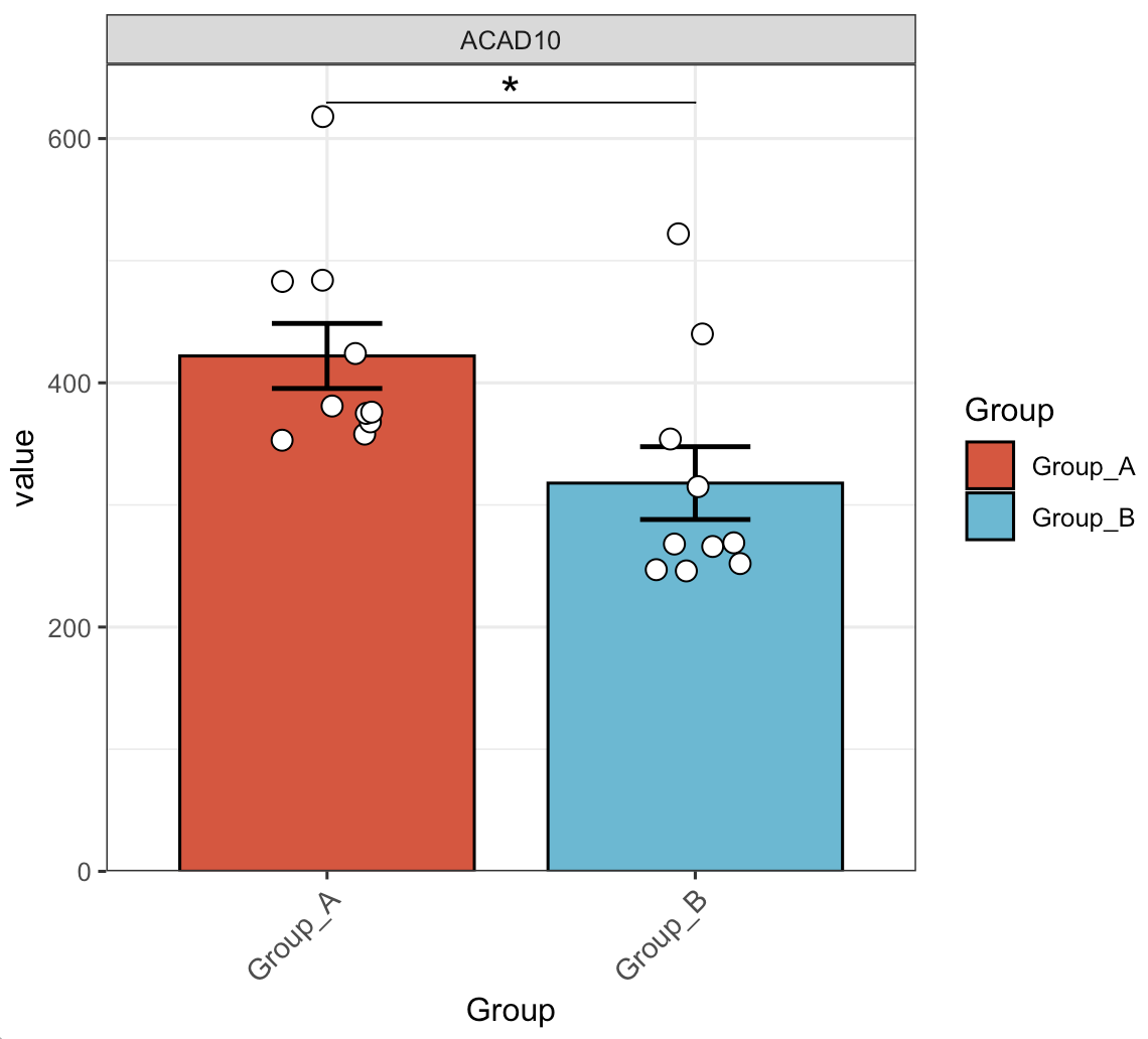
8.1.4 调整统计显示符号
🏷️示例:
MAE |>
  EMP_assay_extract('host_gene',pattern = 'ACAD10') |>
  EMP_barplot(estimate_group = 'Group',label = 'p.signif',label.size=6)
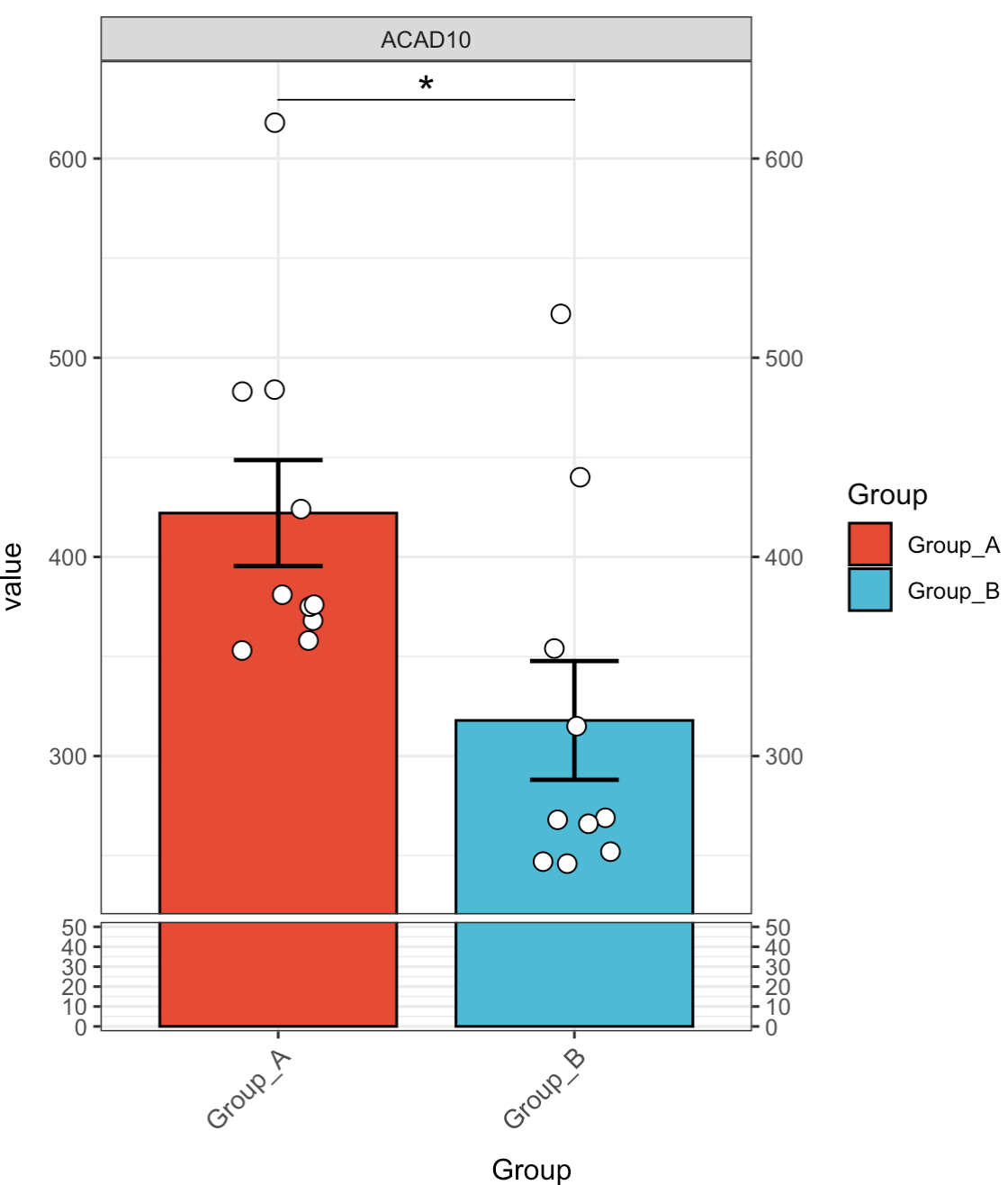
8.1.5 Y轴截断
🏷️示例:
MAE |>
  EMP_assay_extract('host_gene',pattern = 'ACAD10') |>
  EMP_barplot(estimate_group = 'Group',label = 'p.signif',
              label.size=6,y_break = c(50,240))
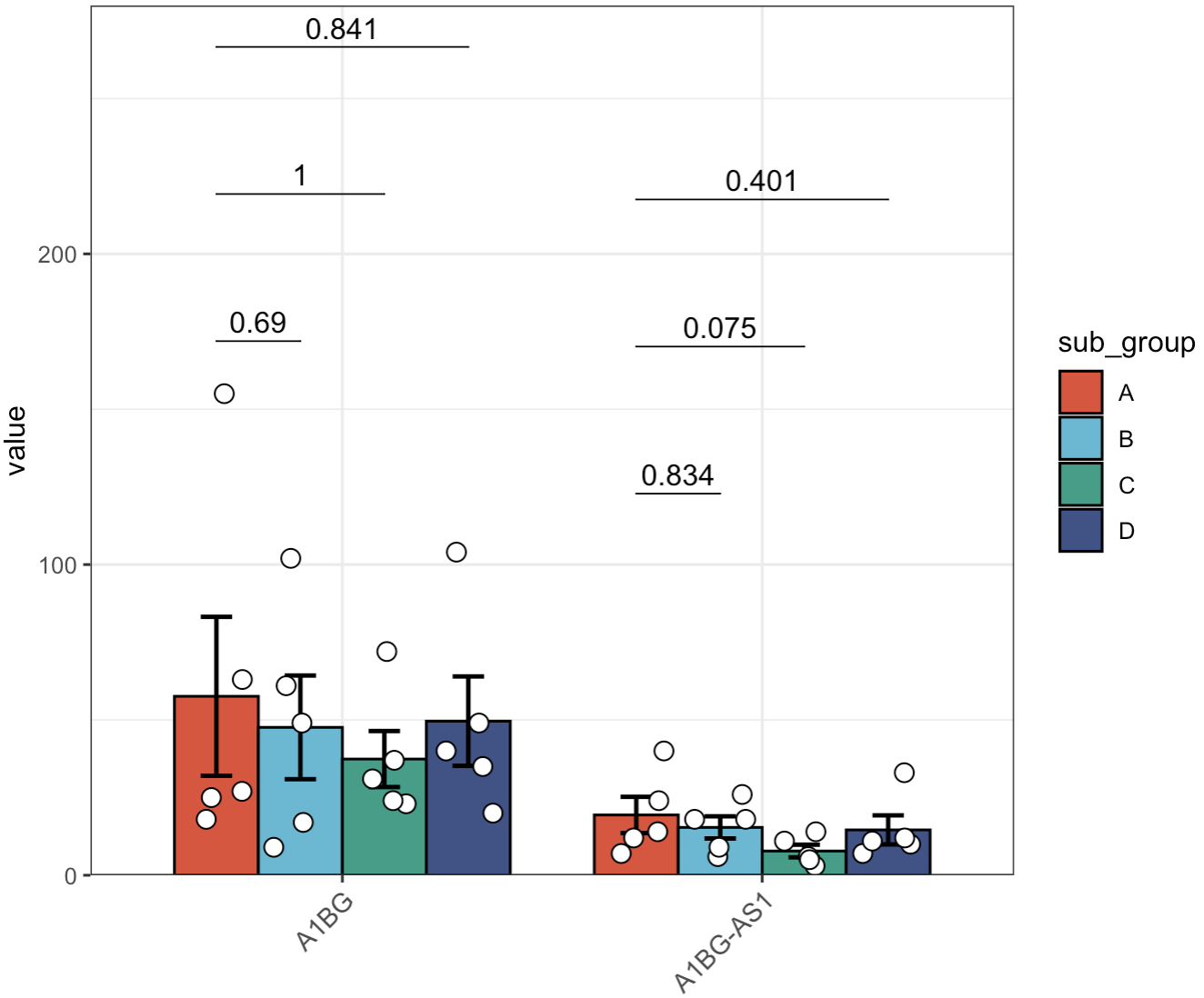
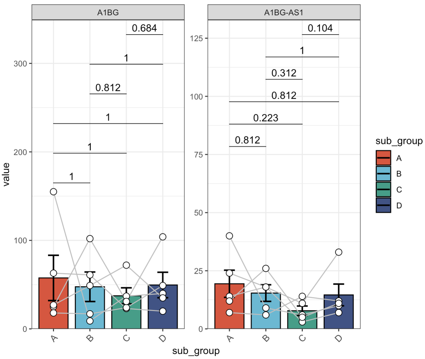
8.1.6 合并多个特征
🏷️示例:
MAE |>
  EMP_assay_extract('host_gene',pattern = 'A1BG') |>
  EMP_barplot(estimate_group = 'Group',compare_group='Sex',facet = FALSE)
8.1.7 修改比较组
🏷️示例1:各组只和A组比较
MAE |>
  EMP_assay_extract('host_gene',pattern = 'A1BG') |>
  EMP_barplot(estimate_group = 'Group',compare_group='sub_group',
              ref.group = 'A',
              facet = FALSE)
🏷️示例2:只选择A和B组比较
MAE |>
  EMP_assay_extract('host_gene',pattern = 'A1BG') |>
  EMP_barplot(estimate_group = 'Group',compare_group='sub_group',
              comparisons = list(c('A','B')),
              facet = FALSE)
8.1.8 配对检验
🏷️示例:
MAE |>
  EMP_assay_extract('host_gene',pattern = 'A1BG') |>
  EMP_barplot(estimate_group = 'sub_group',
              paired_group = 'patient')
8.1.9 绘制GraphPad风格的图
🏷️示例1:
加载风格包
if (!requireNamespace("ggprism", quietly=TRUE)) install.packages("ggprism")
library(ggprism)
GraphPad的多组检验使用tukey检验。
MAE |>
  EMP_assay_extract('host_gene',pattern = 'A1BG') |>
  EMP_barplot(estimate_group = 'Group',compare_group='Status',
              palette = c('white','red','black'),error_bar = 'upper',
              method = 'tukey.hsd',facet = FALSE,
              mytheme ='theme_prism()')
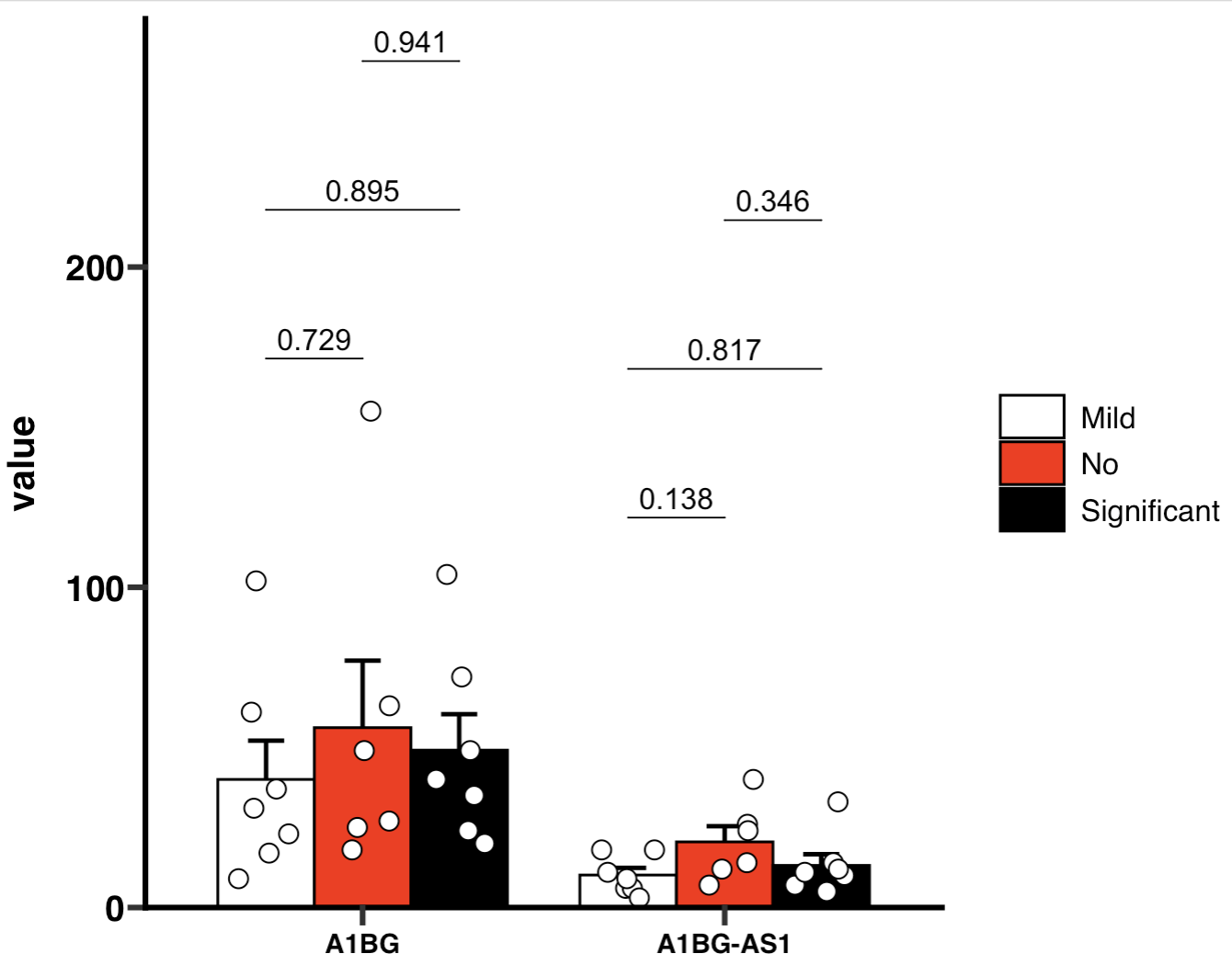
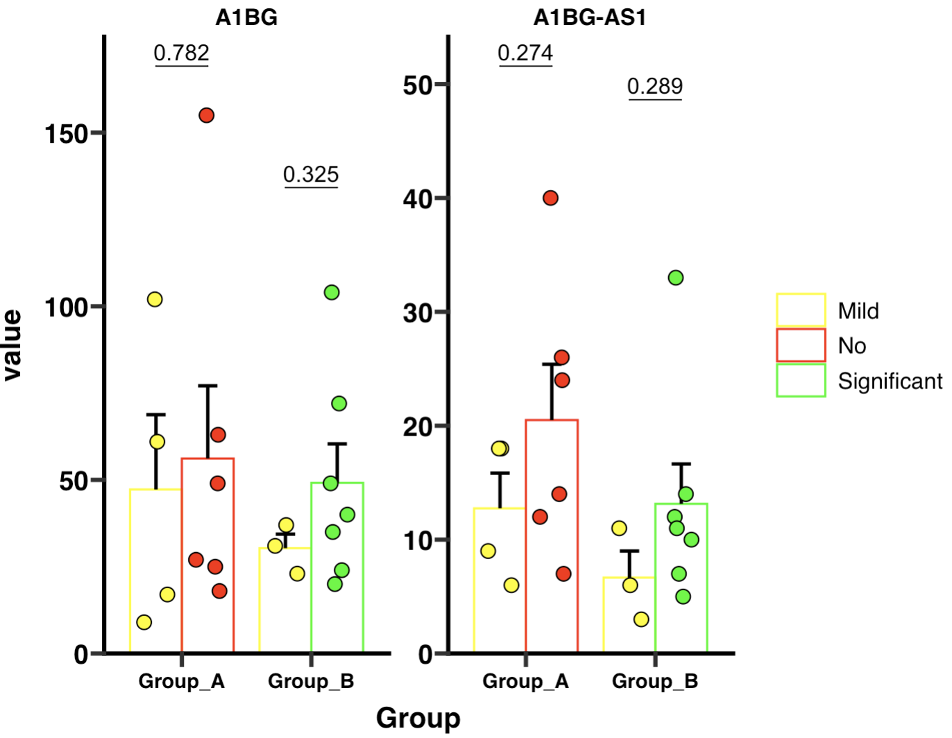
🏷️示例2:
MAE |>
  EMP_assay_extract('host_gene',pattern = 'A1BG') |>
  EMP_barplot(estimate_group = 'Group',compare_group='Status',
              bar_alpha = 0,bar_color = 'group',
              palette = c('yellow','red','green'),error_bar = 'upper',
              method = 'tukey.hsd',dot_color = 'group',
              mytheme ='theme_prism()')